SEATTLE — The NHL’s 32nd franchise has a name: the Seattle Kraken.
Seattle’s expansion franchise, led by majority owner David Bonderman, spent 18 months researching and considered more than 1,200 possible names and 215,000 fan votes. The Kraken was a clear fan favorite because the city was awarded an expansion team in December 2018.
“The Kraken is a name born of the fans. It was suggested and championed by the fans,” said Seattle Kraken CEO Tod Leiweke.
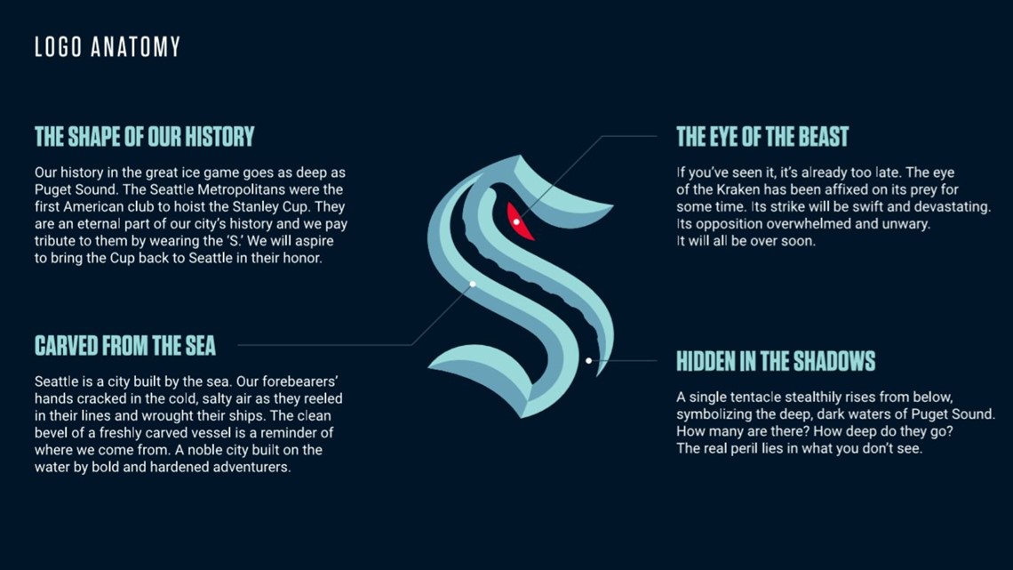
The Seattle Kraken logo was created in partnership with adidas. The logo is in the shape of an “S” in tribute to the Seattle Metropolitans, the first American hockey club to raise the Stanley Cup in 1917.
“We knew that the connection to the Seattle Metropolitans was important,” said Nic Corbett, director of NHL relations for adidas Hockey.
A single tentacle rises from the bottom of the logo “symbolizing the deep, dark waters of Puget Sound,” with a red “eye of the beast” near the top. Including the eye at the top of the logo, Corbett said, was Bonderman’s idea.
The design was “built to honor the game of hockey, our incredible city, and the creature of the deep.”


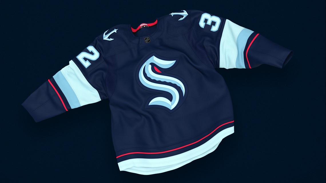
The Seattle Kraken has five main team colors: Deep Sea Navy, Ice Blue, Boundless Blue, Shadow Blue, and Red Alert.
Corbett said Leiweke kept hearing that fans were calling for blue to be a team color, so he knew it was important to include, but he also wanted to make sure that the colors and blues were unique.
“When a player steps onto the ice, [the uniform] needs to have that sense of armor, and certain colors, while they look great under certain lights and in certain environments, they may not carry with it that weight that you're taking into a competition,” Corbett said. “The blues that we selected, we think, provide that sense of confidence and reinforce the story of the Kraken.”
While designing the Seattle Kraken uniform and deciding on the team colors, Corbett said there were three key design markers: It had to be authentic, noble, and mysterious.
Though there were a number of meetings and conversations about the team colors, identifying the colors was “the easy part,” Corbett said. Because a lot of franchise teams are identified by their colors, Corbett said naming the team colors was the hard part.
“We made it clear that in five, 10, 15 years, you don't want to look back and say, ‘well we just refer to our color as navy [blue] or try to rename navy [blue],'” said Corbett. “Let's do it right, right out of the gate, and we did. So that was a priority.”
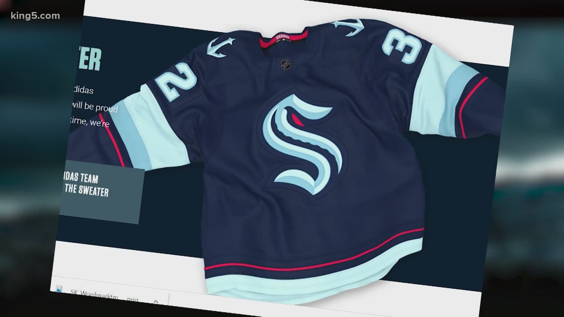
The Seattle Kraken jersey features the five team colors. Corbett said while creating the uniforms, Leiweke and the design team wanted it to be clean, while also having the logo prominently displayed. Once they had a primary mark, he said the design “came together very quickly.”


“It really wasn't until we got into calendar 2020 that we confirmed a name with the team, that the design began in earnest,” Corbett said. “As we entered the late winter, we had a sense that that's where it was going and there was some preliminary internal work that was done. So that when we did get the final word, we were able to move quickly, so it really wasn't the identity itself was a two month process moving very quickly.”
The team will donate all proceeds from net sales of merchandise through August 21 to the nonprofits YouthCare, Community Passageways, and the Urban League of Metropolitan Seattle, which works to end youth homelessness and create opportunities for BIPOC youth.
The Kraken will play beginning with the 2021-22 season.


