SANDPOINT, Idaho — A North Idaho ski resort's new logo has stirred up plenty of controversy on social media this week, leading its CEO to address criticisms in a lengthy Facebook post.
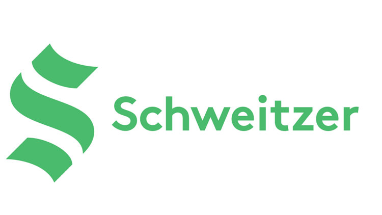
Schweitzer's logo made its Facebook debut on Wednesday, April 7. The ski area also dropped "Mountain Resort" from its name, writing on its website that Schweitzer alone is "much friendlier."
Facebook commenters sounded off on the new design, with many saying they prefer Schweitzer's old logo and others comparing it to that of the Seattle Kraken. The hockey team's logo is in the shape of an “S” in tribute to the Seattle Metropolitans, the first American hockey club to raise the Stanley Cup in 1917.


Schweitzer said its "S" logo with three balanced and symmetrical strokes reflects the physical influences on the resort: the peak of Schweitzer's summit, the flowing terrain and Lake Pend Oreille below.


In a Facebook post on Friday, Schweitzer CEO and President Tom Chasse acknowledged that its new logo "generated quite a stir and plenty of commentary."
"Every decision Schweitzer makes - a new lift location, glading cut, hotel built and obviously a new logo – generates a ton of opinions, feedback and ways we could have done it better," Chasse wrote in part.
Schweitzer is also aware of the logo's similarity to the Seattle Kraken, Chasse said.
"We knew that going in. There are only so many ways to make an 'S'," Chass wrote. "Truthfully, we were well into the logo redesign process when the Kraken came out and we said, dang, 'that’s just like our idea!' But they had probably gone through a process just like us...and beat us to the punch."
Chasse pointed out, though, that the design is also similar to Schweitzer's original 1963 logo, adding that the ski area did go through the trademark process.
"One of our primary goals with this change was - connect to our past, to help forge our future. If you don't see that connection, look a little closer," he wrote.
Despite the pushback, Schweitzer's new logo is "here to stay," Chasse said.
"We are excited to explore the variety and flexibility the new logo gives us. It’ll be a journey for sure - one that we look forward to," Chasse wrote in part. "And one day, we hope you’ll grow to love this design as much as you did the previous versions. And who knows…maybe this one is here for good."


