SPOKANE, Wash. — A resolution on the agenda for Monday's Spokane City Council meeting would create a work group to develop a new design for the city's flag.
The current design was made for Expo '74 and councilwoman Kate Burke hopes to update it to "provide a symbol of which all people in Spokane can be proud and which represents the city we love," according to the resolution.
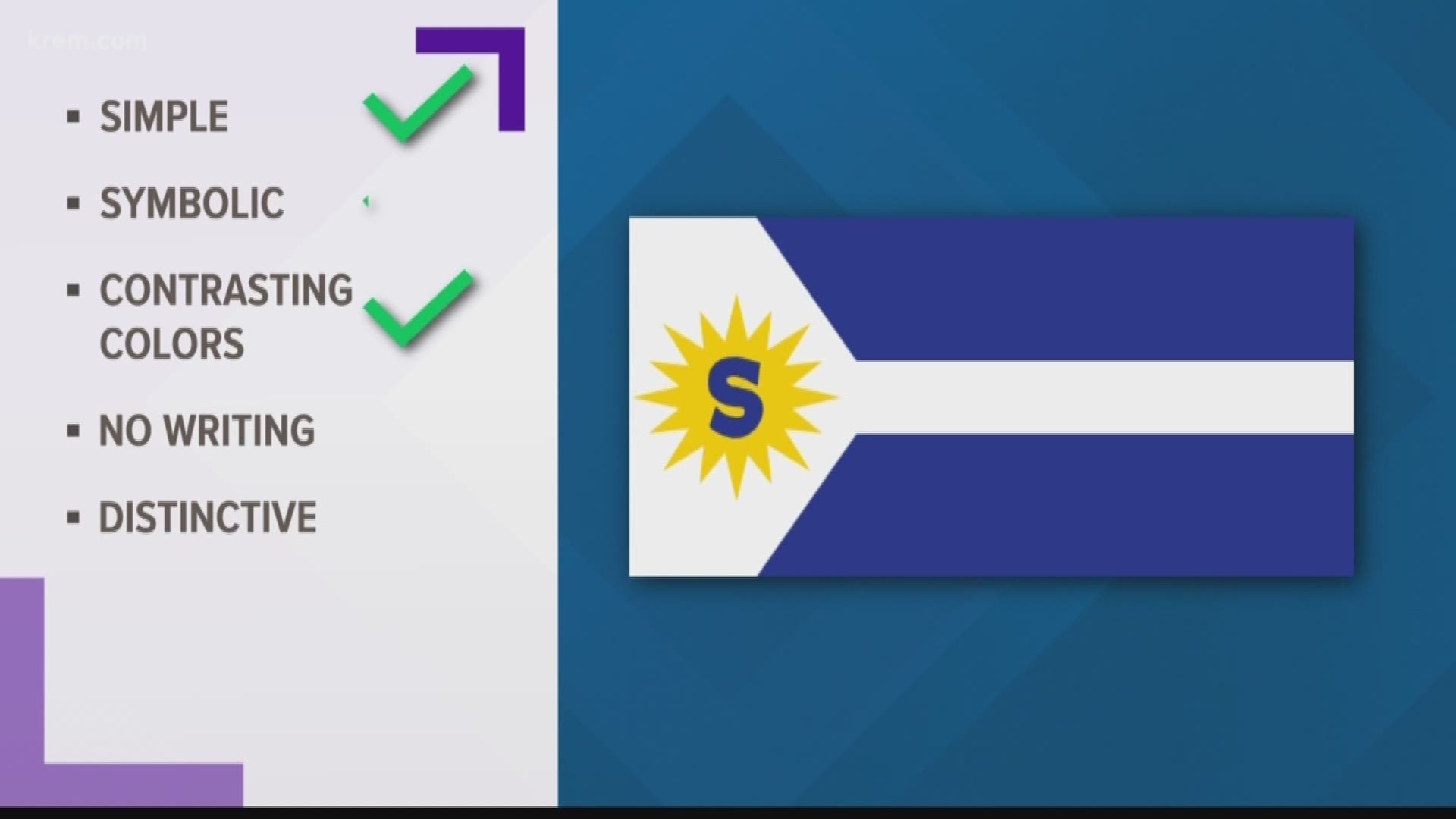
There are some key rules to designing a good flag, according to the North American Vexillological Association. The five core principles are:
- Keep It Simple. The flag should be so simple that a child can draw it from memory.
- Use Meaningful Symbolism. The flag’s images, colors, or patterns should relate to what it symbolizes.
- Use 2 or 3 Basic Colors. Limit the number of colors on the flag to three which contrast well and come from the standard color set.
- No Lettering or Seals. Never use writing of any kind or an organization’s seal.
- Be Distinctive or Be Related. Avoid duplicating other flags, but use similarities to show connections.
How does the current flag stack up?

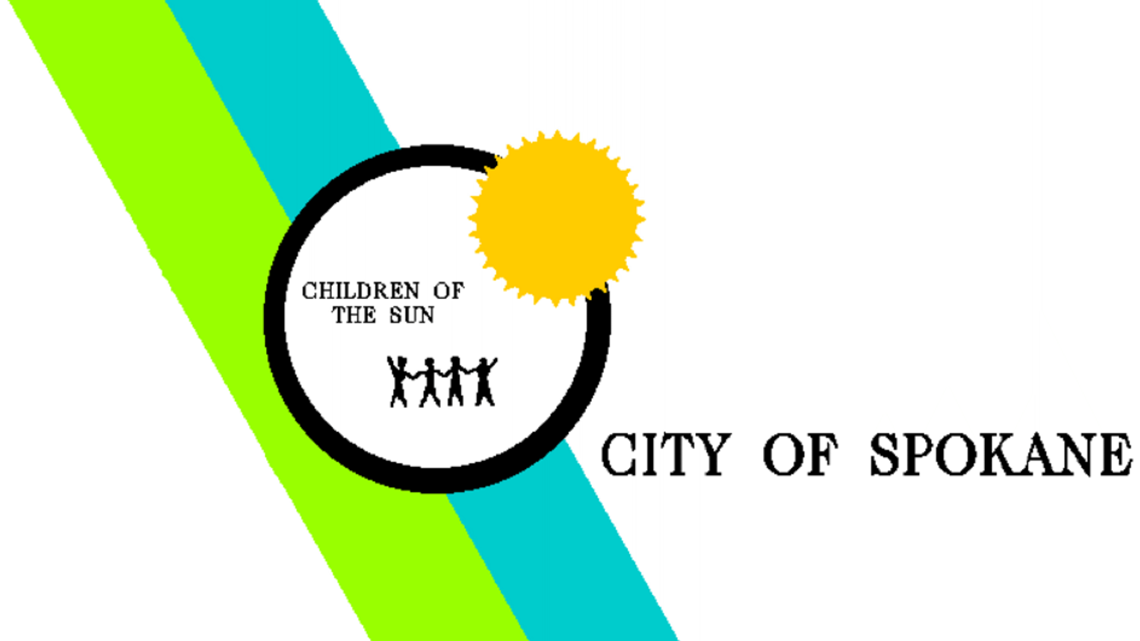
This uses contrasting colors, though perhaps a few too many. It has meaningful symbolism: "Children of the Sun" refers to the Spokane Tribe. It's also distinctive.
However, its simplicity is certainly up for debate. And the real problem: there is tons of writing on it.

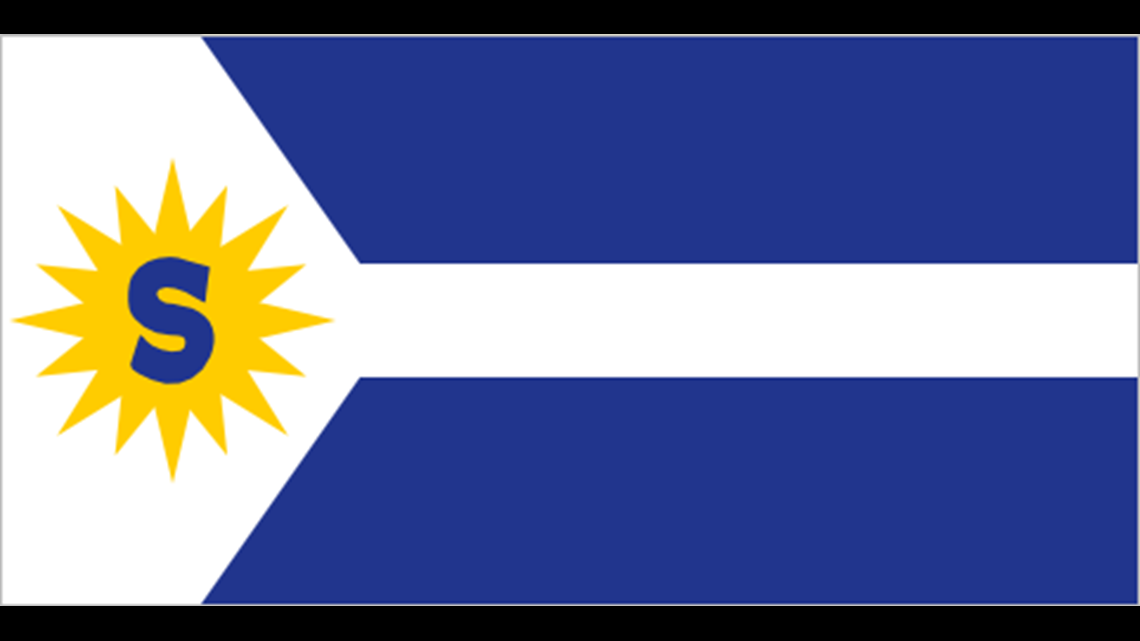
Some have suggested reverting to one of Spokane's original flags.
This one is certainly more simple and has fewer colors. It retains both the symbolism and the distinctiveness.
But the giant letter "S" still violates the fourth rule.


KREM 2 staffers worked together to draw up some draft ideas for potential new flags.
This one is simple and it uses symbolic colors, Spokane's iconic lilac as well as the green and blue associated with the Expo '74 Mobius Strip icon. It also has no writing on it.
But the colors don't contrast well and the flag isn't very distinctive.


This version is more distinctive and it's even more symbolic, using the Expo '74 Mobius Strip icon directly. It also has no writing and is arguably quite simple.
However, the colors still clash.

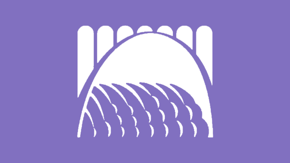
This idea moves away from the Expo theme. It's the waterfall from the city logo placed on a lilac background.
It meets the color, writing, symbolic and distinctive criteria.
But good luck getting a kid to draw this from memory. It's not quite simple enough.


This idea places a lilac on top of a sun. It's got contrasting colors, no writing, multiple Spokane symbols and it's simple.
However, it's perhaps a bit too simple to be reliably distinctive.


This design, posted on Spokane Reddit, takes the current flag design and simplifies it.
Beyond the enhanced simplicity, it also has bolder colors and has removed all of the writing.
The resolution, proposed by Councilwoman Kate Burke, would form a coalition made of two city council members, a resident of each council district, a representative from the Spokane Tribe, the mayor or his designee, one mayor-appointed citizen, one mayor-appointed youth citizen, and a representative from the Spokane Arts Commission.
The work group would have meetings open to the public and would make a single design recommendation to the council no later the December 31, 2019, according to the resolution.

